
B2B Website Research and Design

Scope
◽ Domain, CMS, Analytics, SEO
◽ Client Interviews, Meetings, & Presentations
◽ User Research
◽ Market Industry Research
◽ Information Architecture & Content Strategy
◽ Client Interviews, Meetings, & Presentations
◽ User Research
◽ Market Industry Research
◽ Information Architecture & Content Strategy
◽ Prototypes & Mock Ups
◽ Logo & Branding
◽ Content/Copy Writing
◽ Usability Testing
◽ Launch & Delivery
◽ Logo & Branding
◽ Content/Copy Writing
◽ Usability Testing
◽ Launch & Delivery

Aligning With Stakeholders To Drive Project Goals & Value
.png)
Challenge
Implement a complete digital transformation for this B2B client. Research, Design, and Launch a Website for a Data Center & IT Supply & Business Solutions Startup in Just 3 Weeks

Summary
Mai Supplies an independently owned and operated industrial supply company was looking to expand into the Data Center and IT market with a new supply company.
They needed a website that could serve as a B2B web portal where customers and potential clients could contact sales and get information about the data & IT products, services, and business solutions being offered.
Market & content strategy, branding, copy & content writing, all needed to be consistent with the Mai brand. Comprehensive end to end research and development with an expedited launch date in just 3 weeks.
Problem
Data and IT infrastructure is an operational essential for many businesses and organizations. Yet business owners and executives are constantly burdened with having to navigate a complex and overwhelming distribution and supply chain in order to meet their business needs. This often leads to bottlenecking, lost time and energy, and a host of other logistical and operational headaches.
How Might We?
Provide businesses and executives with a means of meeting their Data and IT supply needs that is Simple, Cost Effective, and Time Saving so that they can quickly meet this need and free up valuable time and energy to focus on what's important ?

Research & Discovery

Client Interviews & Meetings
1
client intake interview
3
strategic planning sessions
4
client feedback sessions
Aligning With Client to Drive Goals and Value
Client intake
form was used to gather information about products and services and get a clear focus on client needs, goals, priorities, timelines, and budget.
Expedited launch date
and constraints meant trimming down lead times & prioritizing key priorities and objectives
Initial client data
would prove critical to making the right design and development decisions


Solutions to guide decisions
Webflow = simple, quick, and cost effective CMS
Provided needed functionality & customizations. Would later allow for rapid development, feedback, and testing
Staged site development
Allowed us to meet priority deadlines without abandoning desired site functionality and content
Minimal yet chunky and informative
Provides excellent products and services visibility and clear paths to directly connect with sales
Bend a few rules
AGILE /Lean UX approach
"Let's get crazy" - Bob Ross
Market Research & Competitor Analysis
7
Direct Competitor Analyses
9
Vendor Product Line Analyses
20+
Industry Sites Reviewed
Informing Design, Architecture, & Strategy With In Depth Market Research
Provided a great baseline for creating strong information architecture and content strategy
What worked well for others provided insights on advantages and driving value
Found competitive advantages in identifying where our competitors missed opportunities and fell short
What worked well for others provided insights on advantages and driving value
Found competitive advantages in identifying where our competitors missed opportunities and fell short


Trends
Spotlight on business advantages and direct sales.
(the "get free quote" button)
Heavy on the use of icons
to make products, services, and priorities visible and easy on user.
Establishing credibility
by making visible well known brands and clients as well as certifications and accreditations.
(the "get free quote" button)
Heavy on the use of icons
to make products, services, and priorities visible and easy on user.
Establishing credibility
by making visible well known brands and clients as well as certifications and accreditations.
Competitive Advantages
Many competitor sites lacked basic integrity
broken links, bad user paths, empty site pages, limited customer support, these would all be easy wins for us.
Lack of a modern and up to date UI/site design.
Several competitor sites were outdated and did not offer enough depth on products and services. In many cases the functionality and ability to interact was extremely limited.
Easy and audience friendly
Increased functionality & increased visibility
Cool, minimal, and modern
layout would provide us with clear advantages.
User Research & Synthesis
3
User Interviews
4
Usability Tests
7
Industry Peer Reviews
User Needs
◽ Access to quality brands and products
◽ 1 on 1 human support
◽ Immediate product availability
◽ Direct shipping
◽ Bundling & discounted pricing
◽ 1 on 1 human support
◽ Immediate product availability
◽ Direct shipping
◽ Bundling & discounted pricing
Challenges
◽ Way too many vendors
◽ Information overload
◽ Keeping up with product trends
◽ Complexity of Data & IT infrastructure
◽ Information overload
◽ Keeping up with product trends
◽ Complexity of Data & IT infrastructure

Enlightening User Insights
“I waste so much time trying to narrow down a price and then find out it’s not even available.....I need to talk with someone"
“You wanna be able to have one account that you deal with, though it normally winds up being two or three, that way when someone has to order something you’re not having to approve all these different orders from different vendors”
“We call them VARs, basically that’s person who figures all this stuff* out for you.”


Drive Value With User Data & Insights!
Having direct access to products only offered through vendors, direct access to support, fair pricing and availability, along with credibility and trust were user priorities that we would need to align with
Ideation, Strategy, & Architecture
Synthesize & Align

* Research findings were presented to stakeholders. This provided a clear picture of potential development costs and scope, how to best align with budget and time constraints, and helped the client understand how to best approach this and what they were going to offer.
Brainstorm With Others
Sketches

Prototype / Style Mock)

User Flow

Initial Sketches, Mocks, & User Flow
Solicited quick and focused feedback from stakeholders and industry professionals.
Increased alignment with client and user needs
Helped drive goals, value, and outcomes
Increased alignment with client and user needs
Helped drive goals, value, and outcomes
Information Architecture

Style, Logo, & Branding
Aligning style and brand
After reviewing many competitor sites, user data, and client objectives there were several visual themes that resonated well with our brand and identity.
Something cool, dark, and modern
Would allow us to stand out amongst competitors and still retain a familiar and professional look and feel.
After reviewing many competitor sites, user data, and client objectives there were several visual themes that resonated well with our brand and identity.
Something cool, dark, and modern
Would allow us to stand out amongst competitors and still retain a familiar and professional look and feel.
Inspo Mood Board
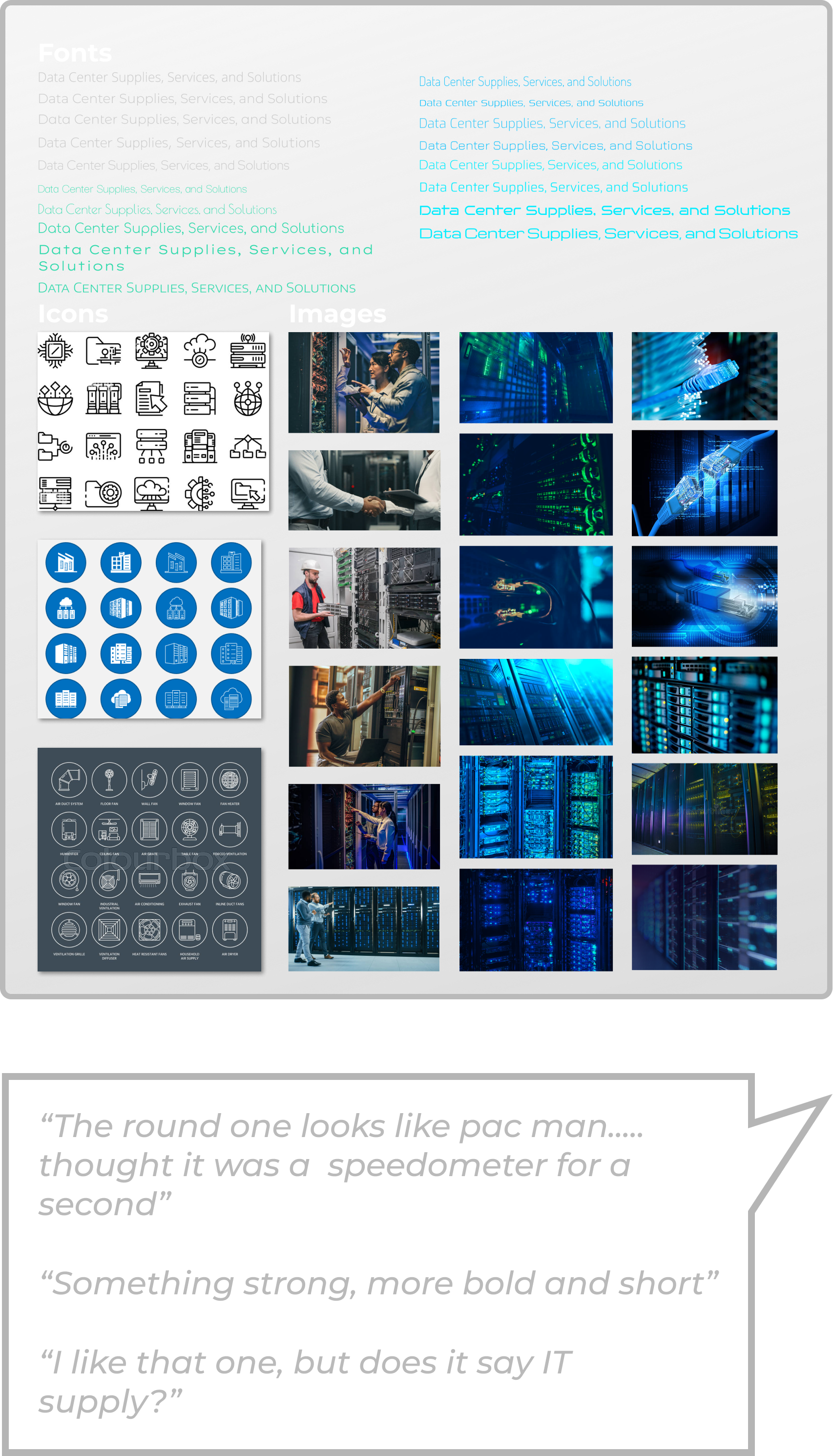
Logo Icon Brainstorming

Post Feedback Logo & Icons

*Drafts of logos and icons were shared with stakeholders and industry professionals to solicit feedback and inform a well aligned and impactful visual style and brand.
Development, Testing, & Launch
Why choosing the right CMS was so important, and how it cut development time in half explained
Fully responsive templates were researched and used as constraints during initial brainstorming and layout that way they could quickly be plugged into the CMS. This enabled rapid development of live, responsive, and fully functional prototypes for usability and beta testing. Bottom line you could produce and higher impact prototype faster and easier in Webflow than you could in a Lo/Mid Fi Figma.
The Style Mockup/Prototype was created and ready for live testing in about an hour, no hand off from Figma to CMS, easily sharable and accessible for stakeholders, users, and industry peers.
The Style Mockup/Prototype was created and ready for live testing in about an hour, no hand off from Figma to CMS, easily sharable and accessible for stakeholders, users, and industry peers.
Made testing and obtaining feedback MUCH more simple for stakeholders, users, and peers. The beta prototype could easily be shared accessed from mobile and desktop prior to it being launched.
Things you cant easily predict or test for in using standard prototyping like Favicons and navigation nuances
Allowed us to comprehensively test the site and its interactions to ensure its integrity prior to a rapid launch.
High Fidelity Prototype

Hi-Fi Prototype | Beta Tester

Usability & Beta Testing

◽ 4 Usability Tests
◽ 7 Peer Reviews
◽ Round of Stakeholder Feedback
◽ 7 Peer Reviews
◽ Round of Stakeholder Feedback
Key Findings & Insights
More information, depth, and wider path to products
Buttons tweaked, aligned, or added
Improve navigation in footer
Retina searing blue should be toned down (smh)
Buttons tweaked, aligned, or added
Improve navigation in footer
Retina searing blue should be toned down (smh)
Final Iteration & Deliverables
Branding, Logos, & Style Guide

Contact Page
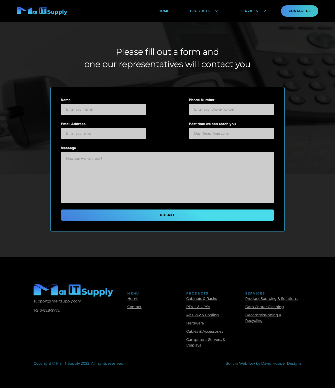
2 Summary Pages


4 Product Pages


Domain
CMS
Email
Analytics
SEO
Integrated and Verified
CMS
Analytics
SEO
Integrated and Verified
Home Page
