Helping to Build a Bridge Between Shona Culture and Oakland Communities with Solid and Insightful Research and Design
Kumusha Foundation Website Overhaul

Role: UX Design and Research, Client Liaison, and Administrator
Timeline: May 24 - June 13 2021
Scope of Work: User Research, User Testing, Client and User Interviews, Heuristic Evaluation, Competitor Analysis, Definition/Ideation/Prioritization, Site Connectivity/Visibility/Functionality, User Flow, User Persona, MVP, and Redesign
Tools: Figma, Miro, Slack, Trello, G-Drive, Canva, Photoshop, Zoom
Team: Kumuasha Founder Julia Chigamba, President: Delisa Branch Kneely, UX Designers: Gillian Hiscox, Sangeeta Pareek


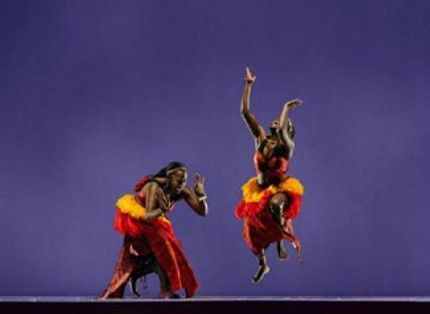
Since I play music and have taught in the Bay Area I knew a WONDERFUL group of Teachers and Performing Artists based out of Oakland and Zimbabwe. As fate would have it, they were in the starting phases of Developing a New Website for their Non Profit Organization, The Kumusha Foundation.
In three weeks they would be getting with another non profit called Flip Cause to Publish a New Site, this was a perfect time to Prototype and Develop a Website for Handoff !

Home Page Design

User Research indicated that in order to get involved with an Organization Users Need Enough Information to get a Sense for what they're about, they can then determine if they are passionate about a cause. Visibility = Engagement + Involvement
We Needed to Create something That Communicated Our Clients Mission, Programs, and Story. Something that Speaks to their Vibrant and High Energy.


Increases Visibility of the MANY awesome productions, classes, and community events
&
Addresses Connectivity across Social Media Platforms, Transactions, and Communications

Donations Page

One of the most prevalent and important findings from research was that:
USERS NEED to know where their Donation is going and how it will be used.
The Clearer the Picture
the Better


Another finding from user research and site analysis was that Ensuring Trustability especially when it involves a transaction was essential, this resulted in a MAJOR Update to the Donation Process, Content, and Layout


Analysis

Home Page
Original
Home Page
Redesign

Donations Page
Changing this banner to something that resonates with Kumusha's audience and vibe
Going from one brief loosely defined statement to 3 Clear and Engaging Statements that Inform the User as to How Donations are Used, Testimonials, Visual Content, and Expanded Options for Donating
Adding a More Trustworthy and Professional Donation Checkout by adding a Standard Form, Trusted Payment Options, and Visible Security

Research
Client and Stakeholder Interviews and Research
User Research, Interviews, and Testing
Competitor Analysis and Heuristic Evaluations
Synthesis
User Persona
User Flow
User Insight
Empathy Map
Connection


Increase user awareness by providing the user with clear information, connectivity, and by highlighting donation options and the communities and projects that are supported by donation efforts.
This helps the user feel confident and comfortable about their choice to get involved and helps the foundation by increasing donations and community engagement.
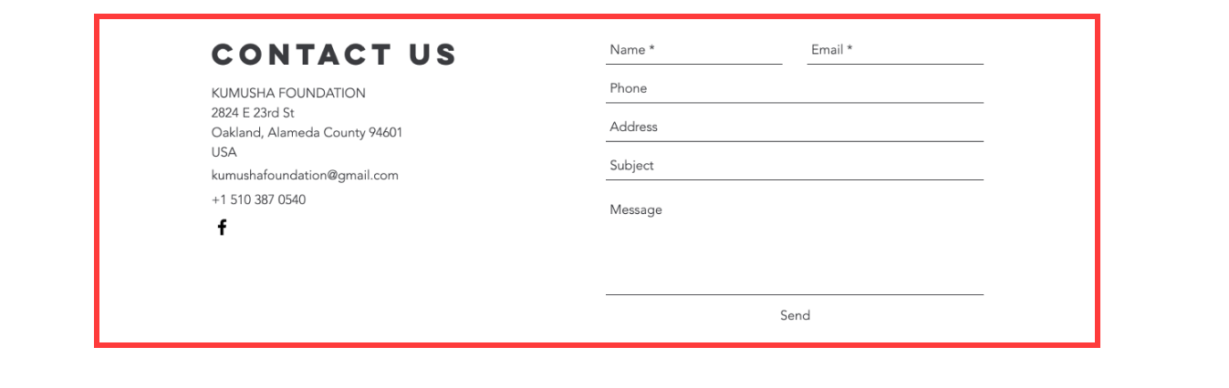
If you would like to know more about this Project or Kumusha Foundation please get in touch!